.png?width=505&height=89&name=GVC%20Mortgage%20(4).png "GVC Mortgage (4)")
Finding the right color swatch for your house
Ready to roll up your sleeves and take the paint roller to your walls?
Before stirring up the can and looking at your home, there are some things to consider. Like, what look are you going for? Do you want the paint to coordinate with your current furniture and décor? And, most importantly, how do you want the room to feel?
First, give the questions above some thought! Then, let’s talk about sorting through color swatches to find the best options.
Stay Away from Red
If you want a room to feel inviting, avoid red. What does the color red represent?
Bold. Confident. Determined.
Red doesn’t exactly whisper “softly” or “gently.” It screams “I’m here!” and “Look at me!” Red evokes emotions of danger or urgency. Think of red lights, stop signs, and emergency vehicle lights. They’re shouting at you to do— or not do—something. This color isn't politely asking you to step inside, take a seat, and relax for a while.
Go Green
On the color wheel and with emotions, the opposite of red is green.
Green is calm. It is a feeling of abundance, rest, and even security. To really go for a calm color, try a light green. Something that reflects the relaxation of nature. Green is also a great choice for guest bedrooms! The color is sure to welcome your visitors and create a room to relax after a day of travel.
Avoid neon or lime green, as those stimulate the brain instead of calming it.
The Sky is the Limit
If you really want to lean into the feel of nature, consider a shade of blue. Sky blue is a calming color that brings the beauty of the outdoors to the inside.
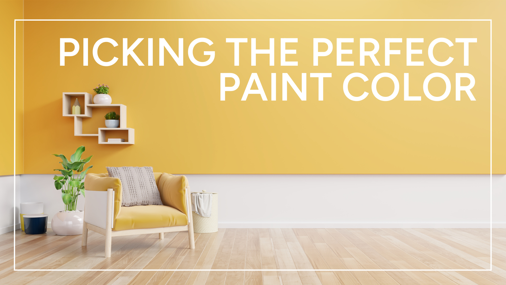
Choose Cheerful
Want something a little more cheerful? Think sunshine. Think happy. Think yellow. This bright color can boost your mood, get your creative juices flowing, and just help balance your overall demeanors. Hues of blue are great to surround yourself with for meditation and peaceful feelings.
Yellow is energetic, making it a great choice for a playroom or game room where family often gathers.
Calm Nuetrals
When it comes to the busiest room in the house – the kitchen – what color should you choose? It’s safe to pick a color that doesn’t add to the busy feeling of the room and demands attention from your eye once you walk inside. Neutral colors, such as creams, tans, and whites, are great subtle choices that don’t compete with everything else already in the kitchen. This is everything from appliances, to cabinets, to decorations.
These are some great color options to choose from – and a warning of those to avoid— but these aren’t your only options! Spend time looking through all your options at the hardware store. Browse through interior décor magazines and see if something catches your eye.
And, if you’re really feeling bold, don’t be afraid to mix some colors together for a perfect blend.